Alto
WEB APP
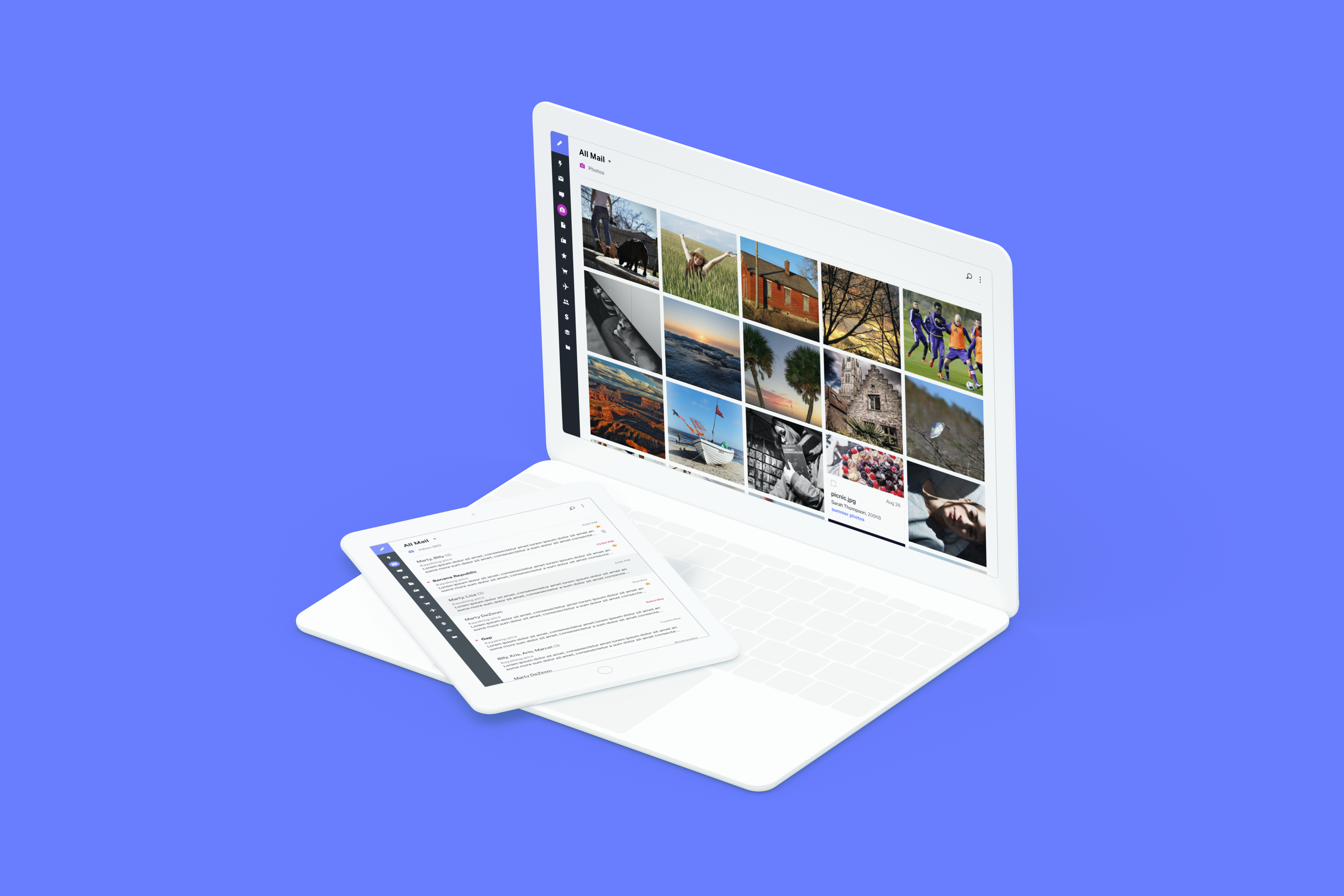
No more digging and searching through your email. Alto surfaces up the important stuff and organizes all your mail accounts in one place, so you can find what you need even faster.


SMART CARDS
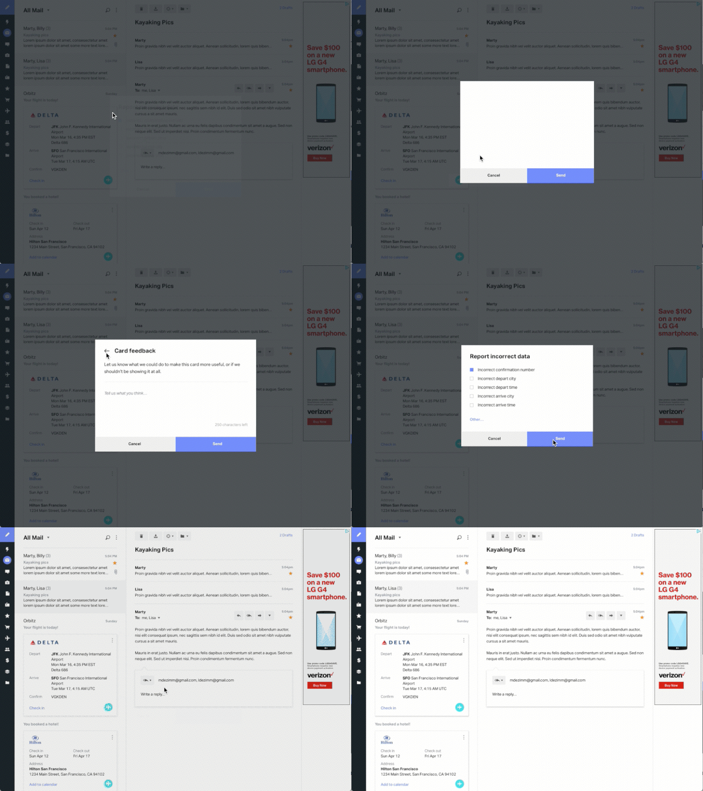
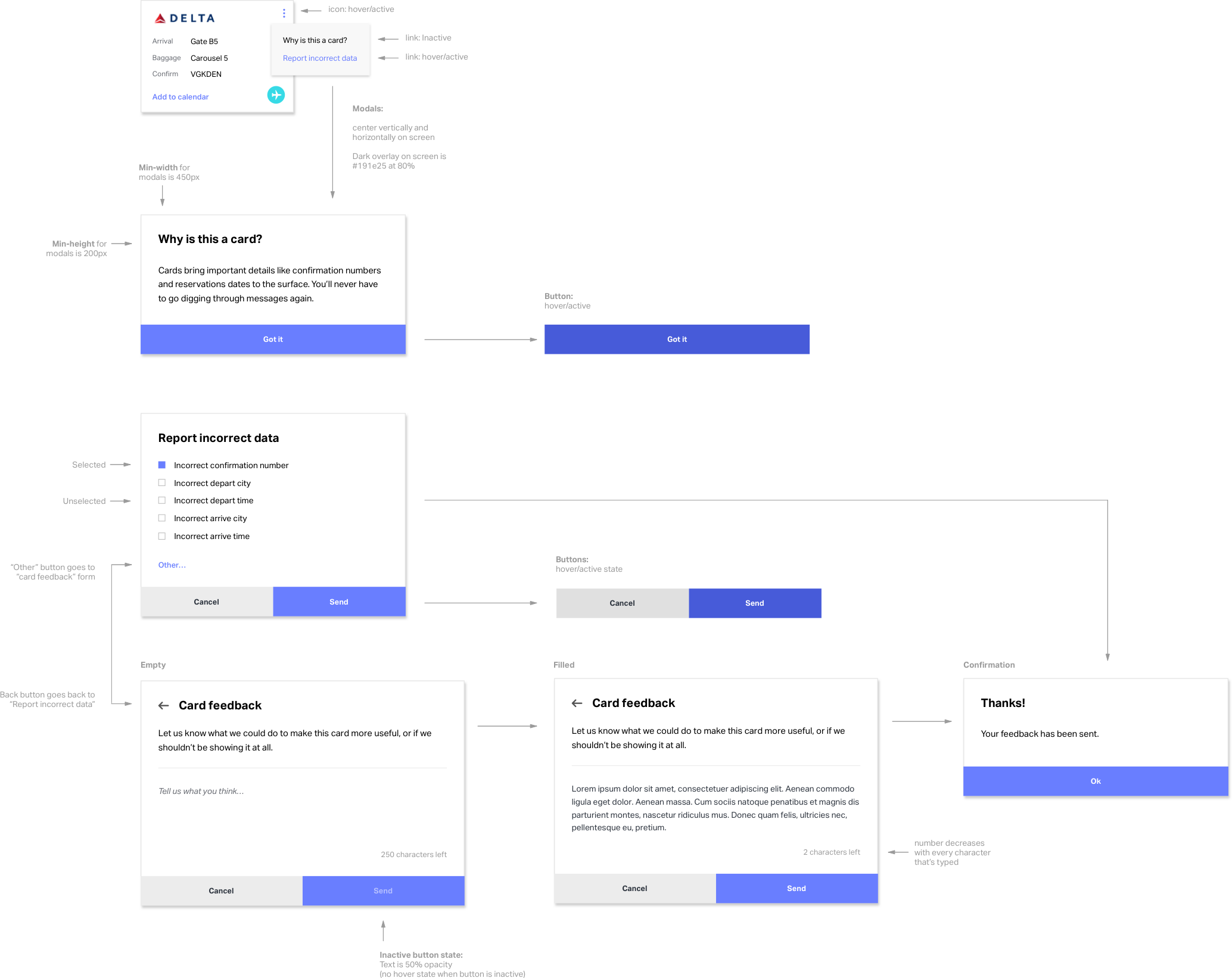
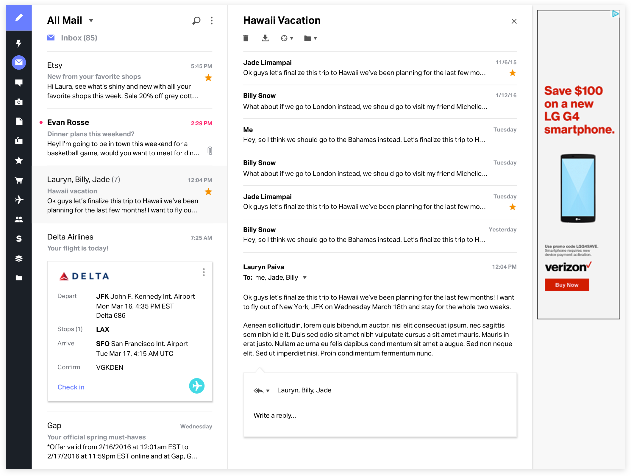
Smart cards surface up all the important details from inside your emails so things like shipping dates and flight numbers are much easier to access. The design system for smart cards needed to be very flexible because information on cards can vary wildly.


DASHBOARD
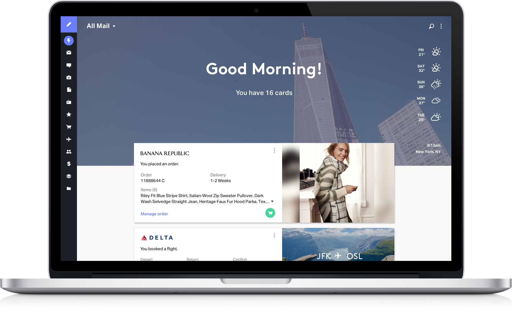
Dashboard is a place to avoid the noise that fills up most inboxes. Important information is extracted out of emails, like travel itineraries and shipment tracking, and displays it as a prioritized list of smart cards.

STACKS
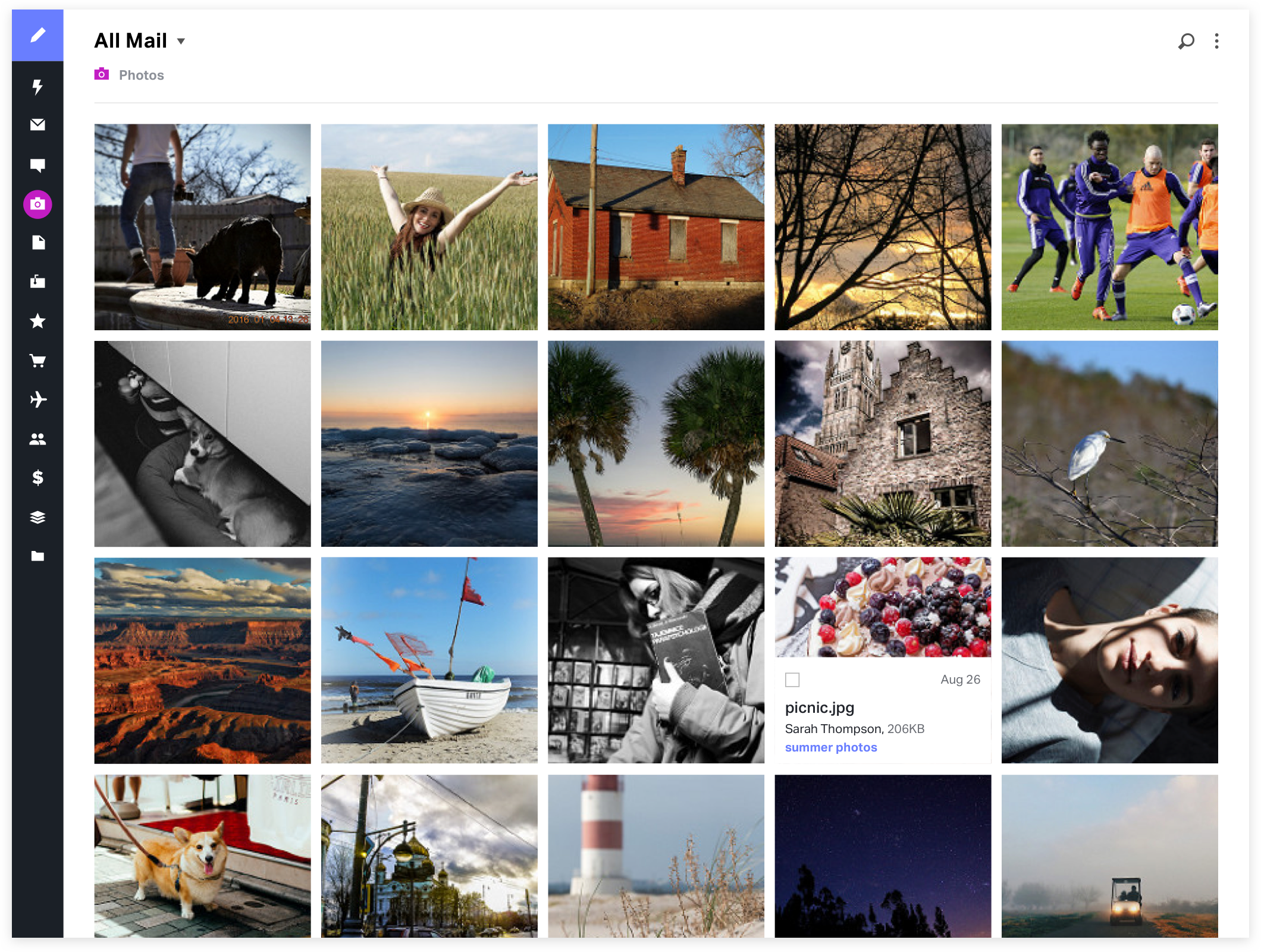
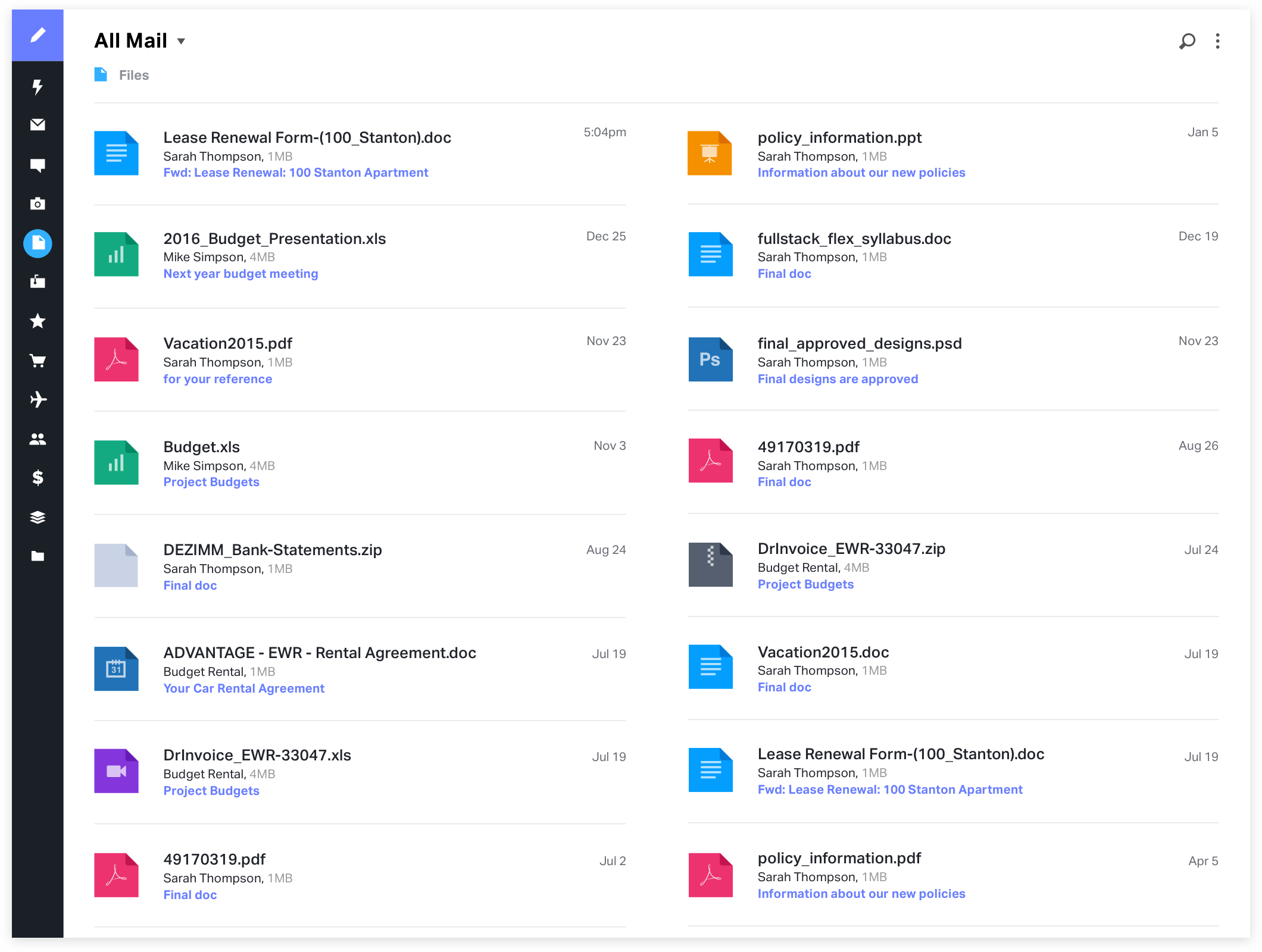
Stacks organize email based on what’s in it, not just who sent it or when it was received. It's not always easy to find photos or files buried in your email by remembering who sent them to you and when. By extracting them and displaying them beautifully, users can locate them significantly faster.


Photo Stack

File Stack

COMPOSING A MESSAGE
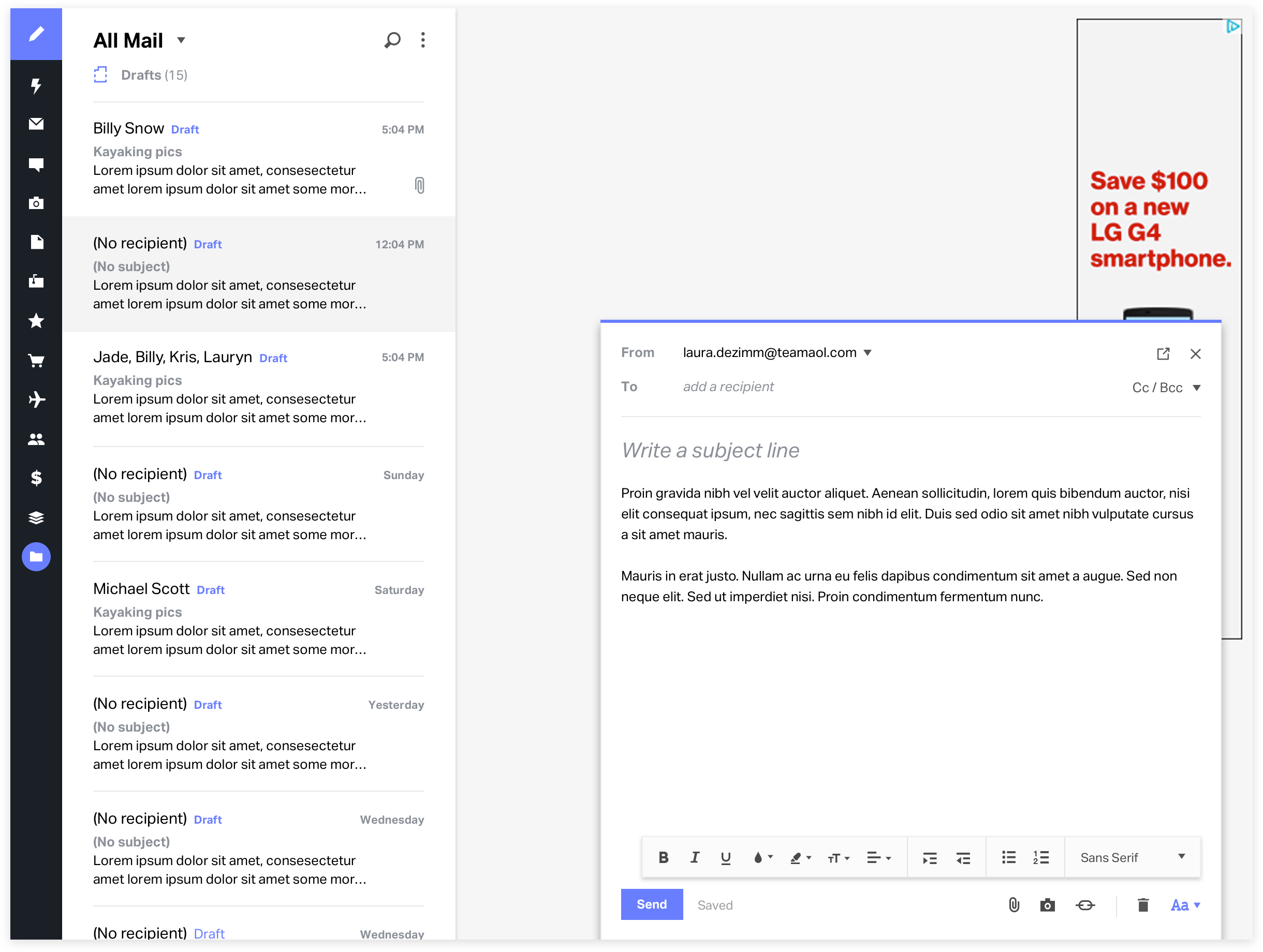
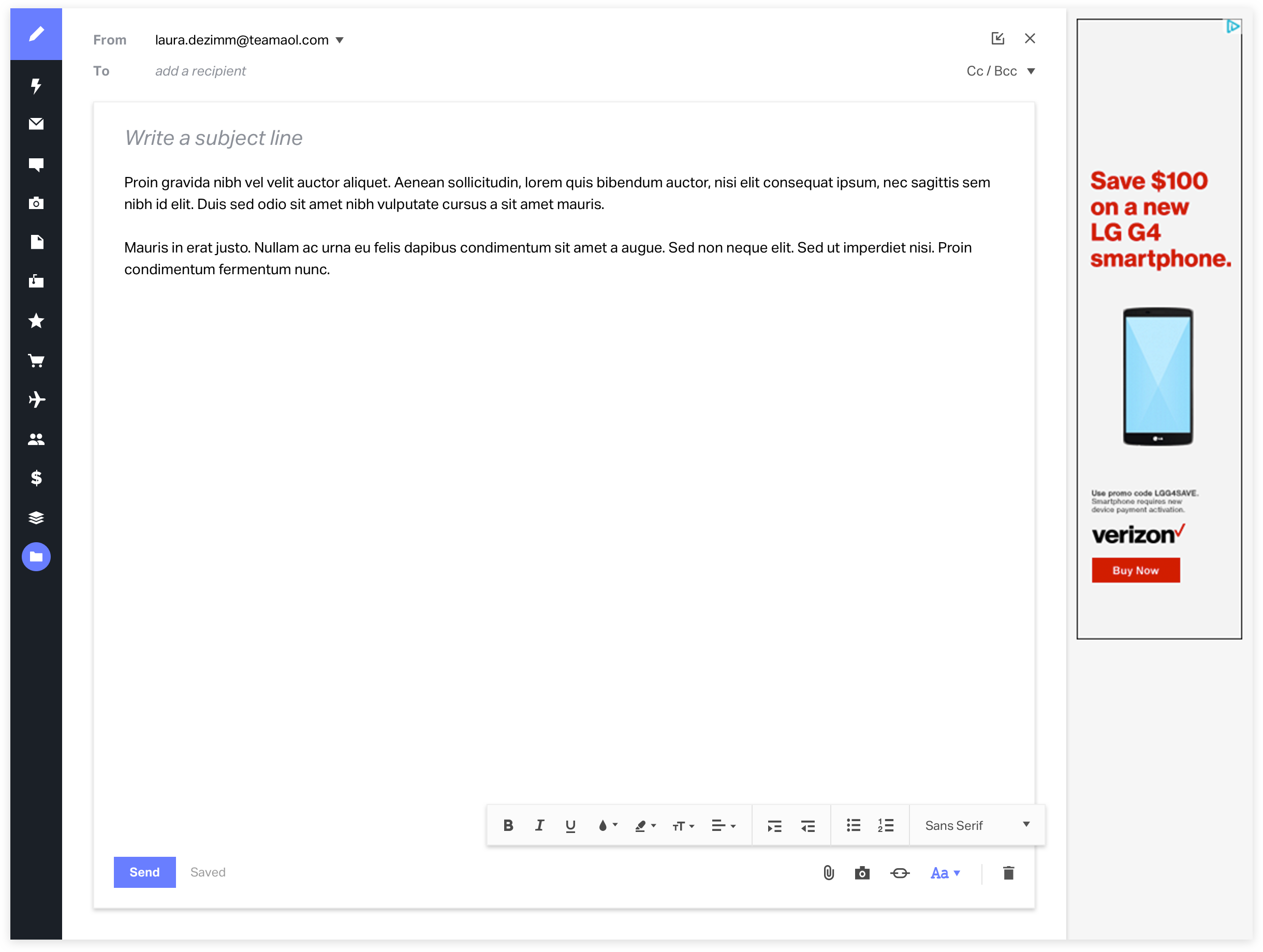
Composing a message in Alto is designed to be a flexible experience. It overlays the interface in a small tab when multitasking is a priority, but expands to a full screen experience when focus and space is needed.
Mini Compose


Full Screen Compose

THE DESIGN PROCESS
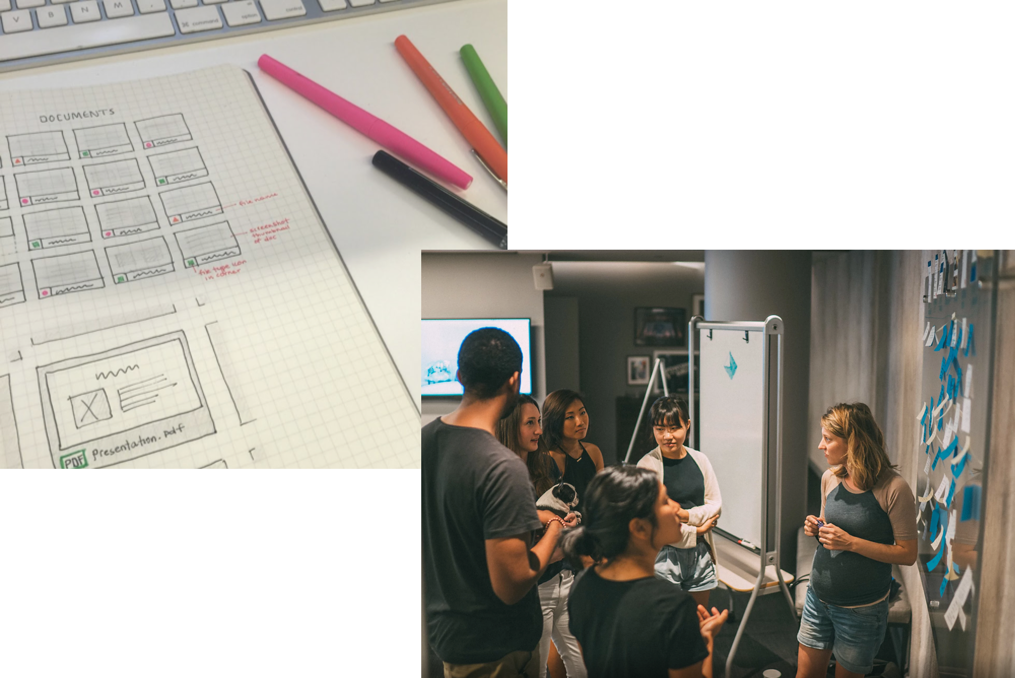
The design team worked together to do brainstorming sessions, design iterations, rapid prototypes and user testing sessions. I worked with a product owner, project manager, front-end developers, and back-end engineers in 2-week sprint cycles to take designs from concept to execution quickly.
